


WIX
To create our website we used the online website creator; wix. We found this website overall quite easy to make our website look professional and we were able to include all the features we wanted. It is simple to use with the elements you can add to your website along the left hand side.

However, we found the website to be very slow when creating our website, it often lagged and didn't save some of the changes we made. This was frustrating for our group, however we were able to work around the issues and still produce our website on time.
WEBSITE DESIGN
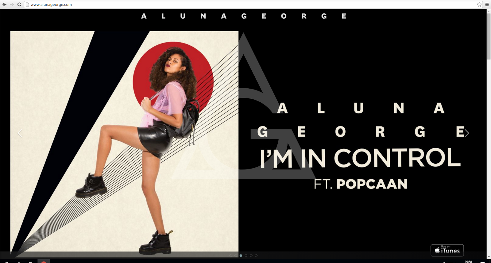
The first thing we did when creating our website was to chose a theme. We chose a scroll theme where the user navigates through the pages using the buttons at the bottom of the page. The website appears as one long page which the user can scroll through. This was inspired by the layout of AlunaGeorge's website:

PAGES
After we had selected our layout we decided to plan what pages we were going to create on our site. After researching into conventions and existing websites we came up with this list:
- Home
- Tour (featuring tour dates and links to buy tickets)
- Videos and Photos (featuring our music video, behind the scenes video and promo shots)
- Shop (featuring our merchandise and the opportunity to purchase it)
- News (featuring updates about our artist)
FONTS AND LOGO
We then wanted to plan our font and logo which would feature across our whole website and make each page synergistic.
The font we decided to use was Asgalt:

We then used photoshop in order to create our MiraJax logo. We created shapes using the line tool and filled them in with the colours we wanted using the paint bucket tool.


We wanted to incorporate the female and male sign and eventually came up with this as out logo:
HOME PAGE
The next thing we created on our website was our home page. We knew we wanted to have a slide show including information about our album and promo shots of our artist. We were inspired to do this by AlunaGeorge's website where the homepage features a slide show of photos of AlunaGeorge:
We created three slides for our home page.
 |
| First Slide on the AlunaGeorge home page |
 |
| Second Slide on the AlunaGeorge home page |
 |
| Third Slide on the AlunaGeorge home page |
 |
| Slide One |
We used the add image, text and social tool on the left sidebar in Wix to add the elements to this slide:


Our second slide features our logo, a shot from our promo shoot and the artist name which were all added using the add image and text tool.


 |
| Slide Two |
 |
| Slide Three |

We used the social media stream tool to add the live twitter feed to our website
We chose to have these three slides as our home page as they all include photos of our artist and the logo which immediately draws the audience in when they enter the site and establishes a clear sense of style and branding which is easy to understand.
We initially had slide three (seen above) as the first slide when you entered our website, however after receiving audience feedback, we were told that when entering the site it wasn't clear that it was the website for a music artist. We therefore changed slide one (seen above) to the first slide to quickly convey that our artist make music.
 |
| Izzy Bizu tour dates |
TOUR PAGE
 |
| Our tour page |
We also photoshopped two photos from our promo shoot using the quick selection tool to get rid of the background and placed them either side of the table to add interest for the viewer and keep the branding and style of our artist clear across all our pages.
VIDEOS AND PHOTOS PAGE
For our videos and photos page we edited together a behind the scenes video using Adobe Premier pro with footage from our narrative shoot. We included this as an interactive feature for the audience and to make our artist seem more relatable and accessible for our audience.

We wanted to create a background to use behind both our behind the scenes video and our music video and so we used photoshop to create a pattern using our logo to use in the background.
This again is synergistic with our home page through the use of our logo again.
We created a grid design showcasing our promo shots of our artist. The user is able to click on each individual photo to enlarge it.


MERCHANDISE AND SHOP
We first used photoshop to create the merchandising products we wanted in our shop. We chose to do a small number of products as our artist are a small upcoming artist they would not have extensive merchandise. We made our products by putting some of our promo shots and our logo onto plain bags and jumpers:


We used the wix add store tool to add our merchadise to a shop on our website:

We then formatted the store so when a customer clicks on an item they are directed to a new page showing the product enlarged and the opportunity to add it to their basket.

NEWS PAGE
For our news page we knew as a group that we wanted to have a blog style which had individual news posts which would mean using the 'add blog' tool on wix. However we discovered it was not possible to add a blog section to our scroll theme, and so we had to redirect the user to a seperate news page using a button at the bottom of our page:
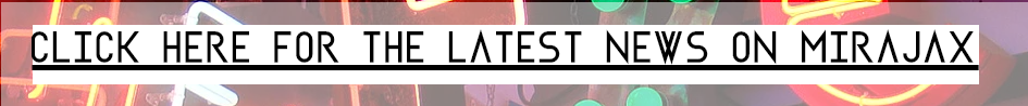 |
| Our button to enter the news page |

AUDIENCE FEEDBACK
We spoke to two members of our target audience Jack (17) and Flora (17) and asked them if there were any features they would like to see added to our website, they came up with:
- more interactivity opportunities
- way to listen to music via the site
We also spoke to Emma aged 17 and asked her some questions about our website:
Is the website easy to navigate around? Yes, I can see there are lots of buttons on the menu bar leading to different pages.
What do you like about the website? It looks very modern and I love the colour scheme! I like the fact the audience is given two ways to navigate around the website. It's good you have lots of pictures of Jack and Ella (Mira and Jax). The listening thing is cool! (the song playback feature)
Any improvements that could be made? I don't like how the song plays without you clicking 'play' as soon as you enter the website-this is distracting. Apart from that, I'm impressed!
ADDED FEATURES
After our audience feedback we decided to add a competition to our news page to add more interactivity for the audience:

We added the opportunity for our audience to sign up to our mailing list using the wix get subscribers app:

We also added a music player using the wix music app which allows listeners to listen to our track Best Be Believing via the website:

 |
| Here is a picture of me editing the website |
No comments:
Post a Comment